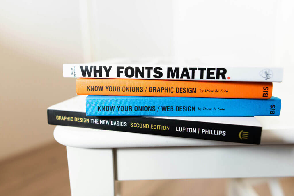
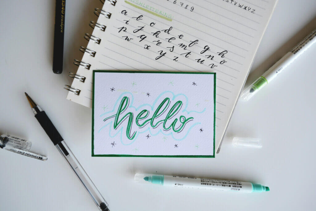
Fonts are one of my favorite aspects of design! I genuinely enjoy selecting the right fonts for clients; I can envision the perfect one in my mind and spend hours browsing to find just the right fit.
However, it frustrates me when I see brands using Arial or Times New Roman. How can you stand out with such boring fonts? Unless, of course, you don’t want to stand out, in which case, feel free to stick with Arial and Times.
But if I were a betting person (which I’m not), I’d wager that you’re not boring. You’re interesting and unique, and your marketing should reflect that. The fonts you choose—ideally more than one—significantly impact how your brand is perceived.
What’s fascinating about fonts is that trends change over time. For instance, when Apple adopted sans-serif fonts, they became synonymous with modernity, and suddenly everyone wanted to use them.
Recently, however, I’ve noticed a resurgence of serif fonts. Perhaps this shift stems from a desire for reliability, as classic serif fonts evoke a sense of trustworthiness. Or maybe it’s simply a change we crave after seeing so many sans-serif options.
Regardless of what “everyone else” is doing, remember: you are not everyone else.
Your brand is unique, and the fonts and colors you select should represent that individuality and communicate more about who you are.

Tips for Selecting Fonts that Match Your Brand Personality
In general, there are four main categories of fonts to consider:
- Serif Fonts
Serif fonts are classic and traditional. They convey professionalism and reliability, attracting customers who value tradition and trustworthiness. - Sans-Serif Fonts
Sans-serif fonts are modern and clean, often used by brands that want to appear straightforward and approachable. They tend to attract younger, more casual customers while exuding an innovative vibe. - Script Fonts
Script fonts are elegant and creative, adding a personal touch. They are frequently used by luxury and boutique brands and appeal to customers who appreciate creativity and exclusivity. - Display Fonts
Display fonts are bold and attention-grabbing, making them ideal for brands that want to make a statement. They attract adventurous customers who enjoy standing out.
What Fonts Should You Pick?
If you engage in creative work often, I recommend selecting one font from each category for your materials. I typically advise clients to choose at least two fonts for their branding: a primary font for most materials and a secondary font for headers or other elements.
Some brands may even opt for three or four fonts. However, consistency is key—stick to those selected fonts across all your materials, from graphics to brochures to websites. This practice ensures that whenever someone encounters your brand, it’s easily recognizable; they won’t confuse it with another company with a similar name.
If you choose a serif font as your primary option, consider pairing it with a sans-serif font as your secondary choice. Alternatively, two serif or two sans-serif fonts can work together if they complement rather than compete with each other.
Finally, consider using an accent font sparingly—typically a script or display font—to add flair to specific materials.
Selecting Fonts in Real Life
For Creare Web Solutions, I chose a serif font for our logo that possesses characteristics of a display font: it’s larger, bolder, and features unique letterforms. To balance this choice, I selected a clean sans-serif font that is lighter and simpler. Together, these fonts effectively capture our clients’ attention while conveying professionalism, creativity, and modernity—qualities we strive to bring to every project.
Not sure how to select the right fonts? Check out Google Fonts for a wide range of free options suitable for your brand. If you have an Adobe account, Adobe Fonts also offers excellent choices. For DIY designs, browse through the fonts available in Canva, keep in mind some fonts in there are only available on the materials you create through Canva, while others are Google Fonts and you can use them on other documents outside of Canva..
Some of My Favorite Google Fonts
Sans-Serif Fonts I Like:
- Montserrat
- Raleway
- Lato
- Open Sans
- Poppins
- Roboto
- Source Sans
Serif Fonts I Like:
- Roboto Serif
- PT Serif
- Noto Serif
- DM Serif
- Lora
- Fauna One
Script Fonts I Like:
- Allura
- Great Vibes
- Lavishly Yours
- Birthstone
Display Fonts I Like:
- Bodoni Moda
- Italiana
These are just a few options among countless possibilities! Google Fonts provides filters on the side to help narrow down your search by feeling or appearance which can be helpful if you’re not quite sure what you’re looking for.

Guidelines for Typography Hierarchy and Readability
As you select fonts, consider their usage and readability. While you may love a display font, it might only be legible at larger sizes (like headings). For larger paragraphs of text, serif or sans-serif fonts generally perform better.
When assessing accessibility, pay attention to how the font displays similar-looking letters (e.g., lowercase ‘l’ vs uppercase ‘I’). Are they distinguishable? Can users easily tell them apart? Characters like ‘0’, ‘a’, ‘e’, and ‘c’ may also appear similar in certain fonts and can be confusing. A lighter weight or narrower font might be harder to read; thus, adjusting letter spacing or line spacing may enhance readability.
This doesn’t mean you can’t use the fonts you love; just be mindful of their size or weight when making final choices. This revision maintains your original voice while improving structure and readability. It also emphasizes key points more clearly for your audience!
Selecting the Right Fonts for Your Business!
Selecting the right fonts for your branding is a crucial step in establishing a unique and memorable identity. Fonts not only convey your brand’s personality but also influence how your audience perceives your business. By understanding the four main categories of fonts—serif, sans-serif, script, and display—you can choose combinations that enhance your brand message. Remember to prioritize readability and accessibility, ensuring that your chosen fonts are legible across various platforms and sizes. Consistency is key; using a limited selection of fonts across all materials will help reinforce brand recognition. With the right approach to font selection, you can create a compelling visual identity that resonates with your target audience and sets you apart from the competition.
Still Struggling selecting the right fonts? Reach out to us, we’re happy to set up a time to consult with you on your branding to ensure you’re recognizable to your target audience.
Frequently Asked Questions
Selecting the Right Fonts for Your Website u0026amp; Branding
Selecting the right fonts is crucial because fonts communicate your brand’s personality and values. The fonts you choose influence how customers perceive your business, whether you appear modern, trustworthy, creative, or bold.
What are the main categories to consider when selecting the right fonts?
When selecting the right fonts, consider four main categories: serif, sans-serif, script, and display fonts. Each category conveys different brand traits—from professionalism and reliability to creativity and boldness.
How many fonts should I use when selecting the right fonts for my branding?
It’s best to select at least two fonts for your branding—a primary font for most materials and a secondary font for headers or special elements. Some brands choose three or four, but consistency is key when selecting the right fonts.
Can I mix different font categories when selecting the right fonts?
Yes! Mixing font categories can be very effective. For example, pairing a serif font with a sans-serif font often works well when selecting the right fonts, balancing tradition with modernity.
What should I consider about readability when selecting the right fonts?
When selecting the right fonts, always consider readability and accessibility. Display fonts might be great for headings, but less legible in body text. Fonts should distinguish similar characters clearly to ensure easy reading.


